Small spaces come with a quiet contradiction: the rooms that most need art to feel finished are the ones where it’s easiest to get wrong. Put too much on the walls of a compact studio and it closes in around you; put too little and the space feels unfinished and bare. And if you’re renting, there’s a second layer of difficulty — you want the place to feel like yours without losing your deposit to a wall full of nail holes when you move out.
The encouraging part is that small spaces actually respond beautifully to the right art. A well-chosen piece can make a cramped room feel taller, wider, and more intentional, doing work that paint and furniture can’t. The trick is understanding how art shapes the perception of space, choosing quality over quantity, and decorating in a way that’s kind to both your room and your lease. Here’s how to do all three.
The Illusion of Space: Vertical vs. Horizontal Display Lines
In a small room, the direction of your art quietly changes how big the space feels. This is one of the oldest tricks in interior design, and it costs nothing to use.
Vertical, portrait-orientation pieces draw the eye upward. In a room with low or standard ceilings, that upward pull creates the impression of more height — the walls feel taller than they are, and the space breathes a little. Hang a tall, narrow piece on a cramped wall and you’re effectively stretching the room toward the ceiling.
Horizontal, landscape pieces do the opposite: they pull the eye sideways and emphasize width. That makes them ideal for narrow hallways, the wall behind a small sofa, or any space that feels pinched and tunnel-like, where you want to visually widen rather than heighten.
The takeaway is simple — match the orientation to the problem. Feeling boxed in and low? Go vertical. Feeling narrow and tight? Go horizontal. Reading the shape of the space before choosing the art turns a blank wall into a tool for making the whole room feel larger.
The “One Statement Piece” Strategy vs. Gallery Wall Clutter
There’s a strong temptation in a small space to fill the walls — a little print here, a tiny frame there, a cluster in the corner. It feels like you’re adding personality. More often, you’re adding visual noise.
Here’s the counterintuitive truth about small rooms: one larger, well-chosen piece almost always looks better than several small ones. A single crisp focal point gives the eye one confident place to rest, which reads as calm and deliberate. A scatter of tiny frames does the reverse — it chops the wall into busy fragments, and in a compact room that fragmentation makes the space feel cluttered and smaller, the exact opposite of what you want.
That doesn’t mean gallery walls are banned in apartments — they can work — but they’re harder to pull off in tight quarters and easier to get wrong. If you do go that route, treat the whole grouping as one shape, keep the spacing tight and consistent, and resist the urge to keep adding “just one more.” For most small spaces, though, the single-statement approach is the safer, more sophisticated choice. Pick one piece you genuinely love, size it generously for the wall, and let it carry the room.
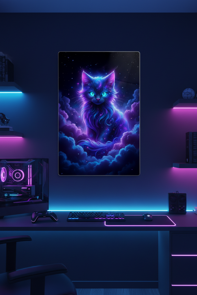
A vertical, frame-free statement piece draws the eye upward to create the illusion of height in compact spaces, while a rental-safe magnet mount keeps the installation completely damage-free.
This is our own design on Displate — buying through our link earns us a small commission at no extra cost to you. Details
👉 View this design on Displate
Landlord-Safe and Damage-Free Decorating Rules
Renting changes the math. Traditional framed art usually means nails or wall anchors, and heavier framed pieces need substantial anchors that leave real holes — the kind a landlord notices at move-out. For anyone on a lease, the goal is art that goes up cleanly and comes down without a repair bill.
This is where frame-free, tool-free options shine. Metal posters that mount with a magnet system are a popular rental-friendly choice because there’s no drilling required — the piece attaches to a slim mount rather than hooks and anchors, so you’re not putting nail holes in the wall. It’s a genuinely easier, cleaner way to hang art in a space you don’t own.
One honest caveat worth knowing: adhesive-based mounts still bond to the wall, and on some surfaces — fresh paint, delicate finishes, certain textured walls — removing an adhesive can lift a little paint. “No drilling” is true and valuable, but “guaranteed zero marks on every wall” isn’t a promise any adhesive can make. The smart move is to test on an inconspicuous spot, avoid hanging on freshly painted walls (give new paint a few weeks to cure), and remove mounts slowly and gently. Done that way, it’s about as low-risk as wall art gets for renters.
Bringing It Together
Decorating a small space well isn’t about cramming in more — it’s about choosing smarter. Use orientation to your advantage, with vertical pieces to lift a low room and horizontal ones to widen a narrow one. Lean toward a single strong statement piece rather than a scatter of small frames that fragments the wall. And if you’re renting, reach for tool-free, frame-free options that go up without drilling — just handle the removal with a little care. Get those right, and even the most compact apartment can feel finished, personal, and surprisingly spacious.
If you’re weighing up exactly how big that statement piece should be, our guide on how to choose the right wall art size for any room covers sizing for the wall you’ve got, and if you do decide to attempt a grouping, how to create a gallery wall shows how to keep it tidy.
Published 06/20/2026 · Last updated 06/20/2026