A gallery wall is one of those things that looks effortless when it’s done well and chaotic when it isn’t. You’ve probably seen them on Pinterest — a beautiful cluster of frames that somehow feels balanced and intentional — and wondered how people actually pull it off without the whole thing looking random. The secret isn’t talent or luck. It’s a method. Once you understand a few simple rules of spacing, balance, and planning, you can build a gallery wall that looks like it was styled by a professional. Here’s exactly how.
What Is a Gallery Wall, Exactly?
A gallery wall is simply a grouping of multiple pieces — prints, posters, or art — arranged together on a single wall as one cohesive display. Instead of a lone piece floating in the middle of a wall, you get a collection that fills the space and tells a story. Gallery walls work beautifully above sofas, beds, and consoles, along staircases, and down hallways. They’re also forgiving: because they’re built from several pieces, you can grow or rearrange them over time.
Step 1: Choose Your Layout Style
Before you touch the wall, decide on the overall feel you want. Most gallery walls fall into one of two camps.
The grid layout uses pieces of the same size arranged in neat rows and columns, with equal spacing throughout. It feels clean, modern, and orderly — perfect for minimalist spaces or when you want a calm, structured look.
The organic (salon-style) layout mixes different sizes and orientations in a looser, more clustered arrangement. It feels collected, personal, and dynamic — great for eclectic or cozy interiors. It looks casual, but it actually takes a little more planning to balance well.
Neither is “better” — it comes down to the mood you’re after. If you’re nervous about getting it right, a grid is the easier place to start.
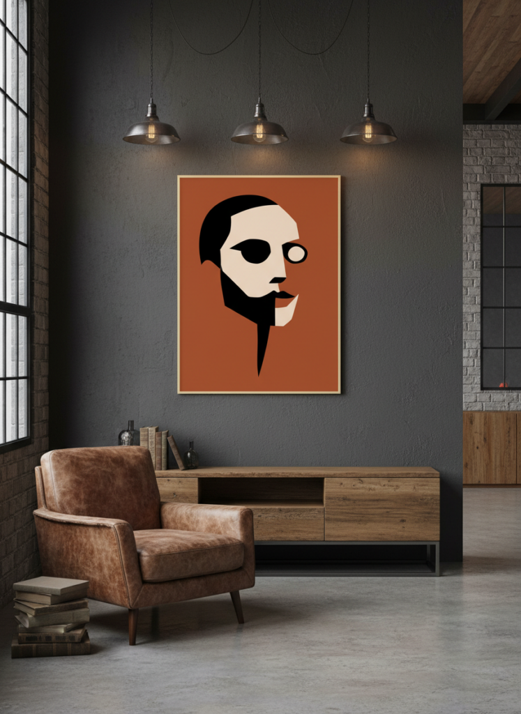
A bold piece like this makes a great anchor to build a gallery wall around. View this design on Displate
Step 2: Pick a Unifying Thread
The single biggest reason gallery walls fail is that the pieces don’t feel like they belong together. The fix is to choose one unifying thread that ties everything visually.
That thread can be a shared color palette (for example, all warm earth tones, or a black-and-white theme), a consistent subject or style (all abstract, all nature, all typography), or a matching frame or finish across every piece. You don’t need all three — just one strong connection is usually enough to make a varied collection feel intentional rather than accidental.
Step 3: Measure Your Space and Plan on the Floor
Here’s the step most people skip — and the one that saves the most frustration. Don’t start hammering nails. Plan it out first.
Begin by measuring your wall, then remember the golden rule of wall art: your arrangement should fill roughly two-thirds of the wall or furniture width below it. A gallery wall that’s too small for its space looks marooned.
Now lay all your pieces out on the floor and arrange them there first. Move things around until the balance feels right. This costs you nothing and lets you experiment freely before committing to a single hole in the wall.
Step 4: Mind the Spacing
Spacing is what separates a polished gallery wall from a messy one, and the rule is refreshingly simple: keep a consistent gap of about 5–8 cm (2–3 inches) between every piece.
That consistency is the magic. Whether your layout is a tidy grid or a loose cluster, equal spacing makes the whole arrangement read as one deliberate unit. Too much space and the pieces drift apart and lose their connection; too little and it feels cramped. Two to three inches is the sweet spot for most walls.
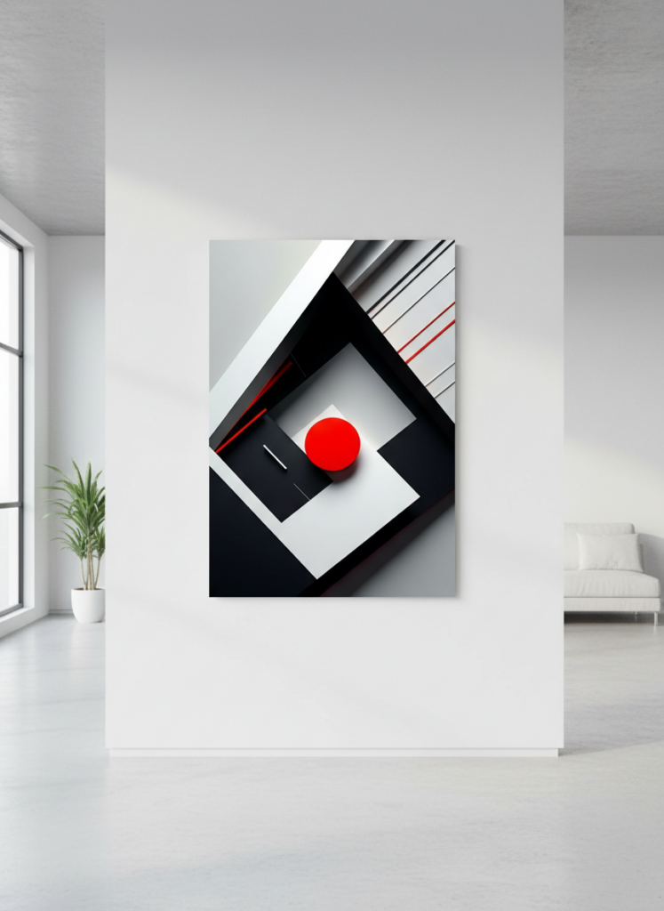
Consistent spacing is what makes a grouping feel intentional rather than scattered. View this design on Displate
Step 5: Use the Paper Template Trick
This is the professional’s secret weapon, and it’s almost foolproof. Before you hang anything:
Trace each piece onto paper (newspaper, kraft paper, or even printer paper taped together) and cut out a template the same size. Then tape these paper cut-outs to the wall using your planned spacing. Step back and look. Because paper and tape move easily, you can shuffle the whole layout around in minutes — raising, lowering, swapping — until it’s perfect. Only once you’re happy do you hang the real pieces, using the paper as your guide for exactly where each one goes.
This single trick removes almost all the risk from a gallery wall. No guesswork, no wall full of mistaken nail holes.
Step 6: Hang at the Right Height
For the arrangement as a whole, aim to center it at eye level — roughly 145–152 cm (57–60 inches) from the floor to the visual middle of the group. If your gallery wall sits above furniture like a sofa or console, leave about 20–25 cm (8–10 inches) between the top of the furniture and the bottom row of art so the two feel connected rather than crowded.
Step 7: Start From the Center and Work Outward
When it’s time to hang, begin with your anchor piece — usually the largest or most eye-catching one — at the center of your planned layout. Then work outward from there, adding pieces around it and keeping your spacing consistent as you go. Building from the center keeps the whole arrangement balanced and stops it from drifting off to one side.
Build outward from a central anchor to keep the whole wall balanced. View this design on Displate
A Few Common Mistakes to Avoid
A handful of small errors trip people up again and again. Inconsistent spacing is the biggest — varying gaps make even great art look messy. Hanging too high is a close second; art should relate to the furniture and eye level, not float near the ceiling. No unifying thread leaves the wall feeling random. And going too small for the space leaves the arrangement looking lost. Avoid those four, and you’re most of the way to a great result.
Final Thoughts
A gallery wall feels intimidating right up until you realize it’s just a series of simple, repeatable steps: pick a layout, find a unifying thread, plan on the floor, keep your spacing consistent, and use paper templates to nail the arrangement before you commit. Take it one step at a time and you’ll end up with a display that looks curated, personal, and professionally styled — and the satisfaction of knowing you did it yourself.