The living room is the hardest room to get right and the most worth getting right. It’s where guests form their first impression, where you spend most of your waking hours at home, and usually where you’ve got the biggest, most visible wall in the house staring back at you. That’s a lot of pressure for one blank space — which is exactly why so many living room walls end up either bare for years or filled with something that never quite looks intentional.
The good news: living room art follows a few reliable principles. Nail the focal point, get the height and spacing right, and match the style to the room you actually have, and the wall stops being a problem and starts being the thing people notice the moment they walk in. Here’s how to do all three.
Start With a Single Visual Anchor
Walk into any living room and notice where your eyes go. Almost always, they land on the largest wall in your sightline — typically the one behind the main sofa, or the wall with the fireplace. This isn’t random. We instinctively scan a room for its focal point, the spot that tells us what the space is “about,” and in a living room that’s usually the seating area’s backdrop.
That instinct is your biggest opportunity. Instead of scattering small pieces around several walls and diluting the effect, give the room one clear anchor on that primary wall. A single large piece above the sofa, or one well-composed grouping centered there, gives the eye somewhere confident to land and makes the whole room feel deliberate. Spread the same art thinly across four walls and the room reads as busy and unfocused; concentrate it into one strong statement and the room feels designed.
If your living room has a fireplace, that mantel wall competes for attention — so pick one of the two (mantel or sofa wall) to be the hero, and keep the other quieter. Two focal points fighting each other is one of the most common reasons a living room feels visually noisy.
Get the Height and Positioning Right
This is where most people go wrong, and it’s the easiest thing to fix. The single most common mistake is hanging art too high. People tend to align the bottom of a frame with their own eye level, which floats the whole piece up near the ceiling, disconnected from everything below it.
The professional fix is the 57-inch rule. Galleries and museums position the center of a piece about 57 inches from the floor, because that matches average human eye level. Not the top of the frame, not the bottom — the center. In rooms with tall ceilings, designers sometimes nudge this up to 58–60 inches for better proportion, but 57 is the reliable default that makes a wall instantly look like someone who knew what they were doing hung it.
There’s one important exception, and the living room is where it applies most: art hanging above furniture. When a piece sits over your sofa, you don’t measure from the floor — you measure from the couch. Keep the bottom of the art 6 to 8 inches above the top of the sofa backrest. Closer than that feels cramped; much higher and the art looks like it’s drifting away from the furniture with an awkward gap of dead wall between them. That 6-to-8-inch band visually “connects” the art to the sofa so they read as one composition.
Two more positioning notes for living rooms. Center the art on the furniture, not the wall — your eye references the sofa beneath it, so a piece centered on the couch looks right even if it’s slightly off-center on the wall. And for groupings or gallery arrangements, treat the whole cluster as a single piece: find its collective center, put that at 57 inches (or 6–8 inches above the sofa), and keep a consistent 2–3 inches of spacing between frames.
Match the Art to Your Living Room’s Style
Once the placement is sorted, the art itself should speak the same design language as the room. Here are three popular contemporary living room styles and the kind of art that genuinely complements each.
Industrial Modern
Industrial spaces lean on raw materials — exposed brick, concrete, black metal, leather, reclaimed wood. The palette is moody and the textures are hard. Art here works best when it echoes that materiality rather than fighting it: high-contrast black-and-white photography, bold abstract pieces, moody cityscapes, or anything with a metallic edge. This is a style where metal posters feel right at home, because the medium itself matches the room’s love of metal and clean, hard surfaces. Keep frames minimal or skip them entirely — the industrial look prefers art that feels structural, not fussy.
Japandi
Japandi blends Japanese minimalism with Scandinavian warmth: muted earth tones, natural wood, uncluttered surfaces, and a deep respect for empty space. The mistake here is overfilling. Japandi art should be calm and restrained — soft botanical line work, serene landscapes, gentle abstracts in sand, clay, sage, and off-white tones. One quiet, well-chosen piece does far more than a busy gallery wall in a Japandi room. Let the negative space around the art breathe; in this style, the emptiness is part of the design.
Biophilic
Biophilic design brings the outdoors in, and it’s having a real moment. Think plants everywhere, natural light, organic shapes, and a connection to the living world. Art that suits it leans into nature: botanical prints, wildlife, landscapes, and organic abstract forms in greens, earthy browns, and warm neutrals. This is the one living room style where a striking wildlife or nature piece can absolutely be your anchor rather than an accent — the whole aesthetic is built around bringing natural imagery into the space, so a bold animal or landscape print fits the brief perfectly.
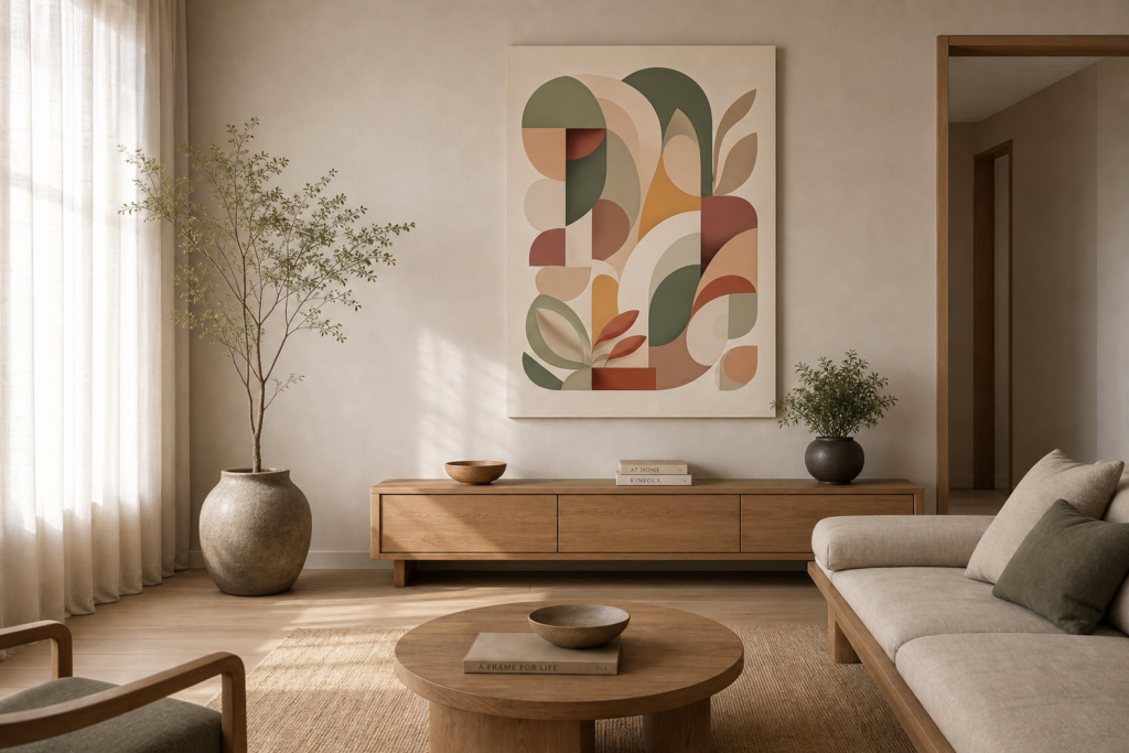
Earthy, organic abstract shapes in muted sage and terracotta tones define the serene, Japandi-inspired aesthetic for 2026 living room trends.
This is our own design on Displate — buying through our link earns us a small commission at no extra cost to you. Details
👉 View this design on Displate
Bringing It All Together
A living room wall that “works” isn’t about expensive art or a clever trick. It’s about three habits: give the room one clear anchor instead of scattering pieces around, hang at the right height — 57 inches on center, or 6 to 8 inches above the sofa — and choose art that matches the style your room is already speaking. Do those, and even a simple piece will look like it was always meant to be there.
If you’re not sure how big that anchor piece should be, our guide on how to choose the right wall art size for any room walks through the two-thirds rule, and if you’re leaning toward a grouping above the sofa, how to create a gallery wall covers arranging multiple pieces cleanly.
Published 06/19/2026 · Last updated 06/20/2026