You’ve found a piece of art you love. The design speaks to you, the size is right, you can already picture it on the wall — and then you hold it up, step back, and something feels off. Nine times out of ten, the culprit isn’t the art itself. It’s the color relationship between the piece and the room around it.
Color is the quiet force that makes a space feel pulled-together or slightly chaotic. The good news is that choosing art colors that work isn’t about having a designer’s eye or memorizing complicated rules. A few simple principles will take you most of the way there, and once you understand them, you’ll never second-guess a purchase again.
Why Color Matters More Than the Design Itself
We tend to shop for wall art by reacting to the image — the subject, the style, the mood. That’s natural, and it should absolutely guide what you choose. But a room doesn’t experience art in isolation. It experiences it next to your walls, your sofa, your curtains, and the light pouring in through the window.
A vivid coral print can look stunning in a showroom and clash badly above a forest-green couch. A moody monochrome piece can disappear entirely against a dark accent wall. The design draws you in, but the color decides whether the piece belongs in the space. Once you start looking at art as part of a color system rather than a standalone object, everything gets easier.
The 60-30-10 Rule
If you remember one thing from this article, make it this. The 60-30-10 rule is the backbone of nearly every well-balanced room, and interior designers lean on it constantly.
The idea is simple. Roughly 60% of a room should be your dominant color — usually the walls, large rugs, and big furniture. About 30% is your secondary color, often upholstery, curtains, or bedding. And the final 10% is your accent color — the pop that brings energy and personality. This is where wall art shines.
Most of the time, your art belongs in that 10% accent slot. It’s your opportunity to introduce a color that isn’t dominating the room but lifts it. If your living room is soft grey (60%) with navy furniture (30%), a piece with a warm amber or burnt-orange accent (10%) will make the whole room feel intentional and alive.
You don’t need to measure anything. Just glance around the room and ask: what’s the big color, what’s the supporting color, and where’s my pop of accent going to come from?
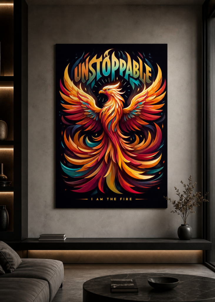
A single warm accent piece can anchor a neutral room and give it a focal point without overwhelming the space. View this design on Displate
Warm Colors vs. Cool Colors
Colors fall broadly into two families, and knowing which family you’re working with prevents most mismatches.
Warm colors — reds, oranges, yellows, and warm earth tones — feel energizing, cozy, and inviting. They tend to make large spaces feel more intimate. They’re a natural fit for living rooms, dining areas, and kitchens where you want warmth and activity.
Cool colors — blues, greens, purples, and cool greys — feel calming, spacious, and restful. They visually open up a room and lower its energy, which makes them ideal for bedrooms, bathrooms, and home offices where focus or relaxation matters.
A reliable shortcut: match the art’s temperature to the mood you want the room to have. Want a bedroom to feel like a retreat? Lean cool. Want a dining nook to feel sociable and warm? Lean warm. You can break this rule deliberately for contrast, but knowing it gives you a confident starting point.
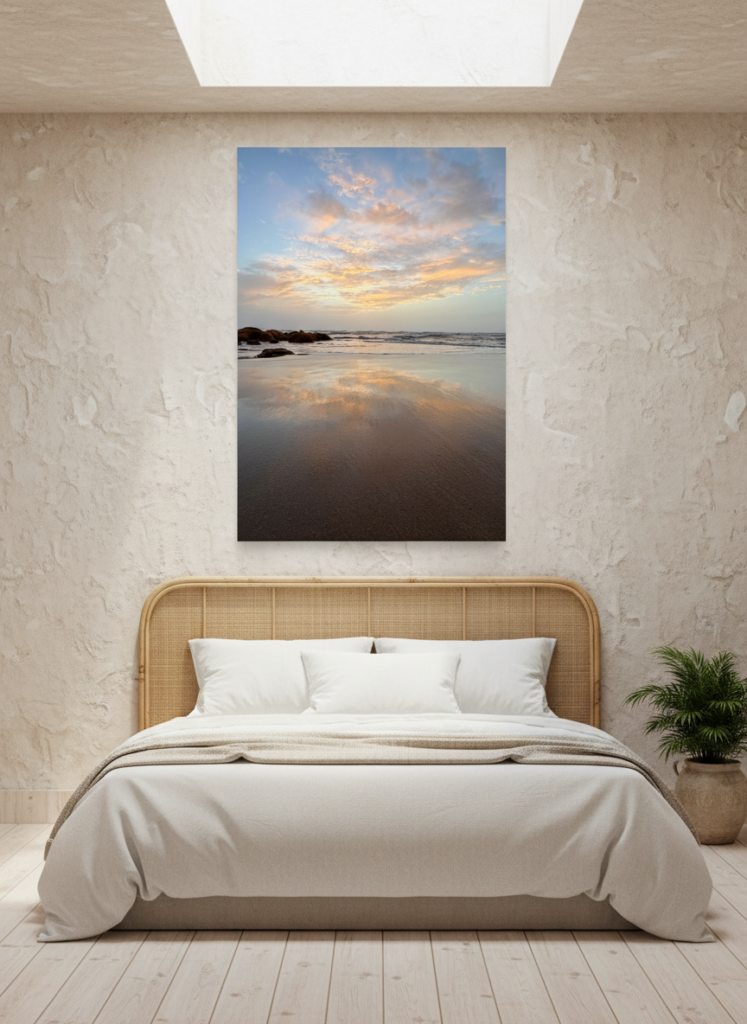
Soft, muted tones bring a sense of calm and space, making them a natural choice for bedrooms and quiet corners. View this design on Displate
Matching Art to Colors You Already Have
The easiest path to a cohesive room is to pull a color from the art that already exists somewhere in your space. If your throw pillows have a teal stripe, a piece with teal in it will instantly feel like it was made for the room. This echo effect tricks the eye into reading the whole space as coordinated, even when the pieces came from completely different places.
Two practical approaches work especially well:
Complementary colors sit opposite each other on the color wheel — blue and orange, red and green, yellow and purple. Pairing complementary colors creates vibrant, high-energy contrast. A blue-dominant room with a warm orange accent piece is a classic example, and it almost always works.
Analogous colors sit next to each other on the wheel — blues and greens, or reds and oranges. These create a softer, more harmonious feel with less contrast, which suits calm, layered spaces.
If you’re unsure, complementary contrast is the safer bet for making a piece stand out, while analogous harmony is better when you want the art to blend gently into an existing palette.
Accent or Blend? Decide What You Want the Art to Do
Before you commit, ask one question: do you want this piece to stand out or settle in?
If you want a focal point — something that draws the eye the moment someone walks in — choose a piece whose colors contrast with the wall behind it. A bright design on a neutral wall, or a deep, saturated piece against a pale background, will command attention.
If you want the art to feel integrated and calm, choose colors that sit closer to your existing palette. The piece becomes part of the room’s texture rather than its centerpiece. Neutral and geometric designs are especially good at this — they add interest without demanding attention.
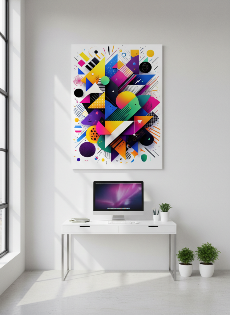
A bold geometric piece becomes a striking focal point, energizing a clean, minimal space. View this design on Displate
A Few Quick Practical Tips
Test in the actual light. Colors shift dramatically between daylight and warm evening bulbs, so picture the piece in the room where it’ll actually hang.
Don’t ignore the wall color itself — a white wall is a blank canvas, but a colored or dark wall is already part of your palette and the art has to work with it.
When in doubt, repeat a color that already appears in the room. It’s the simplest reliable trick there is.
And remember that finish affects how color reads, too. A matte surface softens and mutes tones for a calm look, while a glossier finish makes colors pop and feel more vivid — worth considering once you’ve settled on the palette.
Bringing It All Together
Choosing wall art colors comes down to a few friendly principles: use the 60-30-10 rule to find where your art fits, match warm or cool tones to the mood you want, echo a color that already lives in the room, and decide whether you want the piece to stand out or blend in. None of this requires a design degree — just a moment of looking at your room as a whole before you commit.
Once the color relationship is right, everything else about the piece — the subject, the size, the placement — has room to shine.
Once you’ve settled on the right colors, our guide on how to choose the right wall art size for any room helps you get the scale right. And to keep your finished piece looking vivid for years, how to care for and clean your metal posters is worth a read.