You can choose the perfect piece, in the perfect size, in the perfect spot — and still feel like something’s off. Often the culprit isn’t the art or the wall. It’s the light hitting it. The same print can look rich and deep in one corner of a room and washed-out or glare-blasted in another, purely because of where the light comes from and what kind of light it is.
Lighting is the quiet half of displaying art well, and it’s the half most people never think about until a reflection is bouncing off their favorite piece every afternoon. The good news is that a little understanding of how natural and artificial light interact with your art goes a long way. Here’s how to read the light in your room and position your pieces so they look their best all day.
Sunlight, Glare, and Why Direct Light Is Tricky
Natural light feels like the obvious win — bright, free, flattering. But direct sunlight is the one kind of light that can actively work against your art, in two ways.
The first is fading. Sustained direct sunlight carries UV, and UV is hard on traditional prints over time — it slowly breaks down the inks and binders in paper and canvas pieces, leading to color shifts and yellowing. This is one of the real advantages of metal posters: because the image is fused into the surface rather than sitting on top of it, sublimated metal prints hold their color far longer under bright light than paper does. They’re not literally immortal, but they’re dramatically more fade-resistant, which makes them a safer choice for a sunny wall.
The second issue is glare, and this one affects how the art looks day to day rather than how it ages. A glossy finish is brilliant at making colors pop, but it’s also reflective — point a window straight at it and you’ll catch a bright hotspot or a mirror-like reflection at certain times of day, hiding part of the image exactly when the room is brightest. This is where the matte-versus-gloss decision and the lighting decision overlap: a high-gloss piece needs more careful placement relative to your windows than a matte one, which scatters light and stays readable from almost any angle.
Positioning Art Relative to Your Windows
Here’s the single most useful habit for working with natural light: think about where your windows are before you pick the wall.
The rule of thumb is to hang art perpendicular to your main window rather than directly opposite it. When a piece faces a window head-on, the light comes straight back at the viewer off the surface — that’s what creates the worst glare and the washed-out “blind spot” in the middle of glossy pieces. When the art sits on a wall that runs at a right angle to the window instead, the light rakes across it from the side. That side-lighting grazes the surface, brings out texture and depth, and keeps reflections out of your line of sight.
If your only available wall is opposite a window, you’ve still got options: a matte finish will handle it far better than gloss, sheer curtains can soften the harshest midday light, and simply living with the wall for a day to watch how the light moves across it will tell you whether it’s a problem at all. Light changes hour to hour, so the wall that glares at 2 p.m. may be perfect by evening.
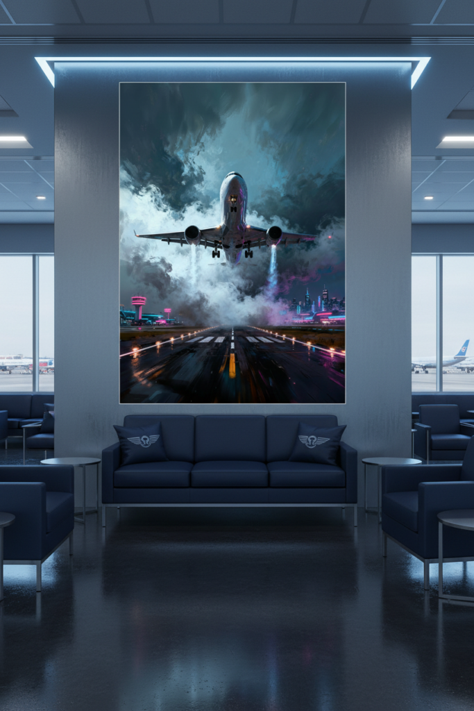
Soft, warm ambient light pools cleanly over a vertical print, highlighting its fine lines without glare.
This is our own design on Displate — buying through our link earns us a small commission at no extra cost to you. Details
👉 View this design on Displate
Artificial Lighting: Getting the Color of Light Right
When the sun goes down, your bulbs take over — and the color of that light changes how your art reads more than most people realize. Light color is measured in Kelvin (K): lower numbers are warm and amber, higher numbers are cool and blue-white.
For displaying art at home, warm light is almost always the better choice. Professional galleries lean heavily on warm tones in the 2700K–3000K range, because that warmth brings out richness, depth, and the emotional quality of a piece. It’s also what suits the rooms art usually lives in — living rooms, lounges, and bedrooms feel cozy and inviting at 2700K–3000K, and your art feels at home in that glow.
Cooler, whiter light around 3500K–4000K has its place — it reads as crisp and clean, and can suit a modern, high-contrast piece in a workspace or a more minimal, gallery-like room. But it’s worth knowing that genuine galleries generally avoid going much cooler than 3000K for artwork, because cool light tends to flatten colors and feel a little clinical. If you love sharp, graphic designs — bold automotive lines, stark geometry — a neutral white can show them off, but for most art in most homes, warm wins. (Interestingly, some studies put the sweet spot for viewing art around 3600–3800K, a hair toward neutral — so if you want one safe all-rounder, a warm-neutral bulb is a sensible middle ground.)
A few practical fixture notes:
Track lights and adjustable spotlights are the most flexible option, letting you aim a beam precisely at a piece and angle it to avoid glare. LED strips or picture lights give a softer, even wash that’s great for larger pieces or gallery walls. Whatever you choose, go LED. Beyond efficiency, modern LEDs run cool and emit virtually no UV, so they won’t heat or fade your art. Older halogen and incandescent spotlights run genuinely hot and are best kept at a distance from paper and canvas pieces — metal handles warmth far better, but cool-running LEDs simply remove the concern altogether.
Putting It Together
Great art deserves great light, and “great” mostly comes down to a few choices: keep delicate paper and canvas pieces out of harsh direct sun (or choose fade-resistant metal for those bright walls), hang art perpendicular to your windows to tame glare, and light it after dark with warm 2700K–3000K LEDs angled to avoid reflections. None of it requires special equipment — just a moment of noticing where the light in your room actually comes from before you reach for the hammer.
Lighting and finish go hand in hand, so if you’re still deciding between a reflective or non-reflective surface, our guide on matte vs gloss: which finish is right for your space is the natural next read. And to make sure your piece is sized right for the wall you’ve chosen, see how to choose the right wall art size for any room.
Published 06/19/2026 · Last updated 06/19/2026