Your bedroom is the one room in the house that’s entirely yours. It’s the last thing you see before you fall asleep and the first thing you wake up to, which gives it a quiet power over how you rest and how you start your day. Yet it’s often the most neglected room when it comes to decoration — the place where leftover furniture and blank walls end up.
The art you choose for a bedroom does more than fill space. It sets a mood. The right pieces can turn a functional room into a genuine retreat, somewhere your mind associates with calm and switching off. The wrong ones can quietly keep a room feeling busy and unsettled. Getting it right isn’t complicated, but it does call for a slightly different approach than the rest of your home.
Why Bedroom Art Is Different
In a living room or office, art often works hard — it’s a focal point, a conversation starter, a hit of energy. In a bedroom, you usually want the opposite. The goal is to soothe rather than stimulate, because this is a space designed for winding down.
That single shift changes everything about what you choose. A bold, high-contrast piece that looks fantastic in a hallway can feel restless above a bed. Subjects, colors, and even finishes that energize a workspace can quietly work against sleep here. So the guiding question for bedroom art isn’t “what grabs attention?” but “what helps me relax?”
Calming Color Palettes
Color is the fastest way to set a restful tone, and in a bedroom, softer is almost always better.
Cool tones — soft blues, gentle greens, and muted teals — are the classic choice for a reason. They’re associated with calm, openness, and rest, and they can make a bedroom feel like a cool, quiet sanctuary. A piece dominated by these tones lowers the visual energy of the room without making it feel cold.
Soft neutrals and muted earth tones — warm greys, sand, soft terracotta, dusty rose — bring warmth and a sense of grounding. These work beautifully if cool blues feel too clinical for you, creating a cozy, enveloping calm instead.
Muted over saturated is the real rule here. Whatever color family you choose, lean toward gentle, desaturated versions rather than bright, punchy ones. A faded sage green soothes; a vivid lime green energizes. The same applies across the spectrum — softness is what signals rest to the brain.
What to use sparingly: large areas of intense red, bright orange, or high-contrast black-and-white directly facing the bed. These are stimulating colors, and while a small accent is fine, a dominant dose can subtly keep a room feeling alert.
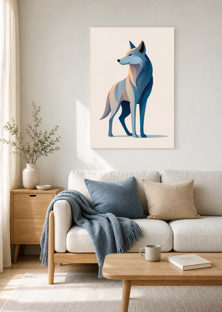
Soft, cool tones lower the visual energy of a room, helping a bedroom feel like a calm, restful retreat. View this design on Displate
Subjects That Soothe — and Ones to Reconsider
Beyond color, the subject of a piece carries its own emotional weight, and bedrooms reward gentle choices.
Calming subjects tend to share a sense of stillness. Nature scenes — calm water, soft horizons, misty forests, gentle landscapes — have a well-documented restful effect. Abstract pieces with flowing, organic shapes feel soothing in a way that sharp, angular designs don’t. Botanical art, soft florals, and quiet minimal designs all suit a bedroom’s relaxed purpose. So do serene single subjects: a sleeping animal, a single tree, a quiet moon.
Subjects worth reconsidering above the bed are the energetic ones — aggressive action scenes, intense or confrontational imagery, anything visually loud or chaotic. These aren’t “bad” pieces; they’re simply better suited to rooms where you want energy rather than rest. There’s also an old design instinct worth respecting: many people prefer to avoid unsettling or melancholy imagery in the spot they look at last thing at night. Choose something you genuinely find peaceful.
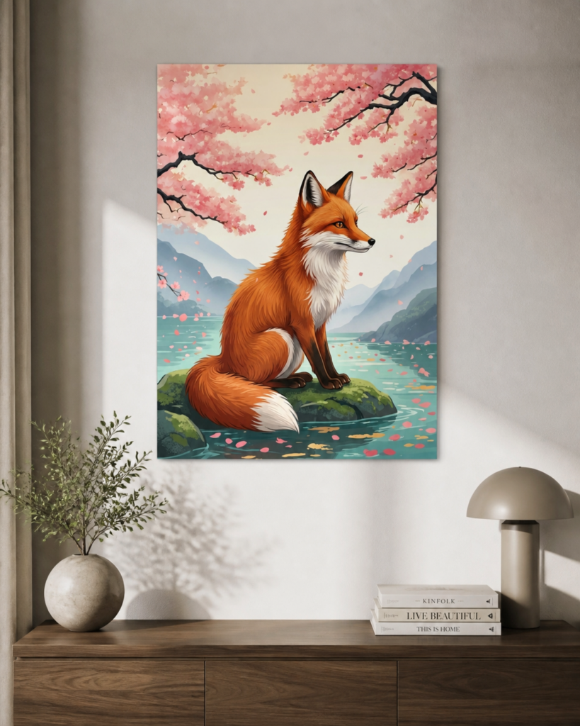
Gentle, peaceful subjects — a quiet animal, soft blossoms, still water — reinforce a sense of calm and relaxation. View this design on Displate
Placement Above the Bed
The space above the bed is the natural home for bedroom art, and getting the placement right matters both visually and practically.
For proportion, a good rule of thumb is that art above a bed should span roughly two-thirds of the width of the headboard or bed frame. A piece that’s too small floats awkwardly and looks lost; one that fills the space feels intentional and balanced. This is one of the most common bedroom decorating mistakes — going too small.
For height, hang the piece so its center sits comfortably in view when you’re sitting up in bed or standing in the room, typically leaving a hand’s-width or so of gap above the headboard rather than pushing it up toward the ceiling.
A quick word on safety and peace of mind: many people feel more relaxed knowing whatever hangs above their head is secure and lightweight. This is one area where metal posters have a practical edge — they’re light and mount flush to the wall, so there’s no heavy framed glass overhead. It’s a small thing, but it contributes to the easy, unbothered feeling a bedroom should have.
A serene, tranquil piece sits comfortably above the bed, adding a quiet focal point without disturbing the room’s restful mood. View this design on Displate
Finish and Light in a Bedroom
Finish is easy to overlook, but it changes how a piece feels in evening light. Bedrooms are often lit by soft, warm bedside lamps, and a glossy surface can pick up and reflect those light sources, creating small bright hotspots that catch the eye when you’re trying to relax.
A matte finish tends to suit a bedroom better. It diffuses light softly, keeps colors gentle and muted, and reads calmly from any angle — all qualities that align with a restful space. If you love a particular piece that only comes in a glossier finish, just be mindful of where your lamps sit relative to the wall, so you’re not facing a reflected glare from bed.
Bringing It All Together
A restful bedroom comes down to choosing gently: lean on soft, muted color palettes rather than bright ones, pick subjects that feel still and peaceful, size and place your art in balanced proportion above the bed, and favor a matte finish that won’t catch the lamplight. None of it requires a designer’s eye — just a moment to ask whether a piece makes the room feel calmer.
Do that, and your bedroom becomes what it’s meant to be: a quiet retreat that helps you rest, unwind, and wake up a little easier.
Not sure how large your office piece should be? Our guide on how to choose the right wall art size for any room covers proportions. And to match your art’s tones to your workspace, how to choose wall art colors that match your room pairs well with this one.