The kitchen and dining room are where a home actually lives — where meals get made, conversations happen, and people naturally gather. Yet they’re often the last rooms anyone thinks to decorate. The kitchen gets treated as purely functional, all cabinets and counters, and the dining room frequently ends up with one lonely picture and a lot of bare wall.
That’s a missed opportunity, because these rooms have plenty of personality to gain from the right art. But they also come with a challenge no other room does: heat, steam, humidity, and airborne grease. A piece that would last decades in a bedroom can buckle, yellow, or grime up within a year over a busy stove. So decorating these spaces well is partly about style and partly about choosing materials tough enough to survive the environment. Here’s how to get both right — art that suits the room and holds up to the cooking.
Styling Vertical Wall Space in Culinary Environments
Kitchens hide more usable wall than people realize. Counters, cabinets, and appliances eat the lower half of the room, but the vertical space above them — between upper cabinets and ceiling, beside a window, on the end of a cabinet run, or on any open accent wall — is often completely blank and ready to work.
Modern kitchen design has moved well past the era when the only “decoration” was a tile backsplash. Today’s kitchens increasingly treat a wall as a genuine design surface, with a piece of art bringing warmth and character to a space that’s otherwise hard edges and reflective surfaces. A single well-placed piece on an open wall, or a print tucked into a breakfast nook, softens all that stainless steel and stone and makes the kitchen feel like part of the home rather than a utility room.
The key is placement away from the splash zone where possible — an accent wall, the dining-adjacent side, or a nook — so the art reads as intentional styling rather than something that wandered in from another room. Vertical pieces work especially well here, drawing the eye up and making use of the tall, narrow gaps kitchens tend to leave empty.
The Threats of Cooking Humidity, Airborne Grease, and Steam
This is the part that makes kitchen art genuinely different from anywhere else in the house, and it’s worth taking seriously before you hang anything you care about.
Cooking throws a surprising amount into the air. Boiling pots and steam raise humidity sharply, and humidity is the enemy of paper. Over time, moisture makes paper prints buckle, ripple, and warp; in poorly ventilated kitchens it can even encourage mold along the edges and yellowing across the surface. A paper poster that looked crisp on day one can start to sag and discolor within months of regular cooking nearby.
Canvas has its own vulnerability: its woven fabric fibers are absorbent. In a kitchen, that means canvas can slowly soak up airborne grease, cooking odors, and moisture, gradually dulling the image and holding onto smells that are nearly impossible to clean out. What works beautifully in a living room can become a grease-trap over a stove.
This is where metal posters have a real, practical edge in kitchens and dining rooms. A metal surface doesn’t absorb moisture, won’t warp in humidity, and doesn’t soak up grease or odors the way fabric does. Best of all, it’s genuinely wipe-clean — a damp cloth takes care of the everyday film that builds up in any cooking space, and the image underneath is unaffected because it’s fused into the metal rather than sitting on a porous surface. For the one room in the house where art has to survive steam and splatter, a non-porous, washable material isn’t just a nice-to-have; it’s the sensible choice.
Selecting Color Layouts and Themes That Harmonize with Dining Zones
In dining areas, color does quiet work on the mood of the room. Warm, earthy tones tend to suit these spaces best — think deep terracotta, warm wood tones, muted emerald greens, and rich, grounded neutrals. These colors feel inviting and relaxed, the kind of palette that makes a table feel like somewhere you want to linger over a meal.
Cooler, harsher tones — stark neons, clinical blues, anything cold and electric — tend to fight the warmth a dining space wants. That doesn’t mean you can’t use bold or high-contrast art; it means anchoring it in tones that feel warm and natural rather than sterile. A striking piece in grounded, earthy colors brings personality to the room without breaking its welcoming mood.
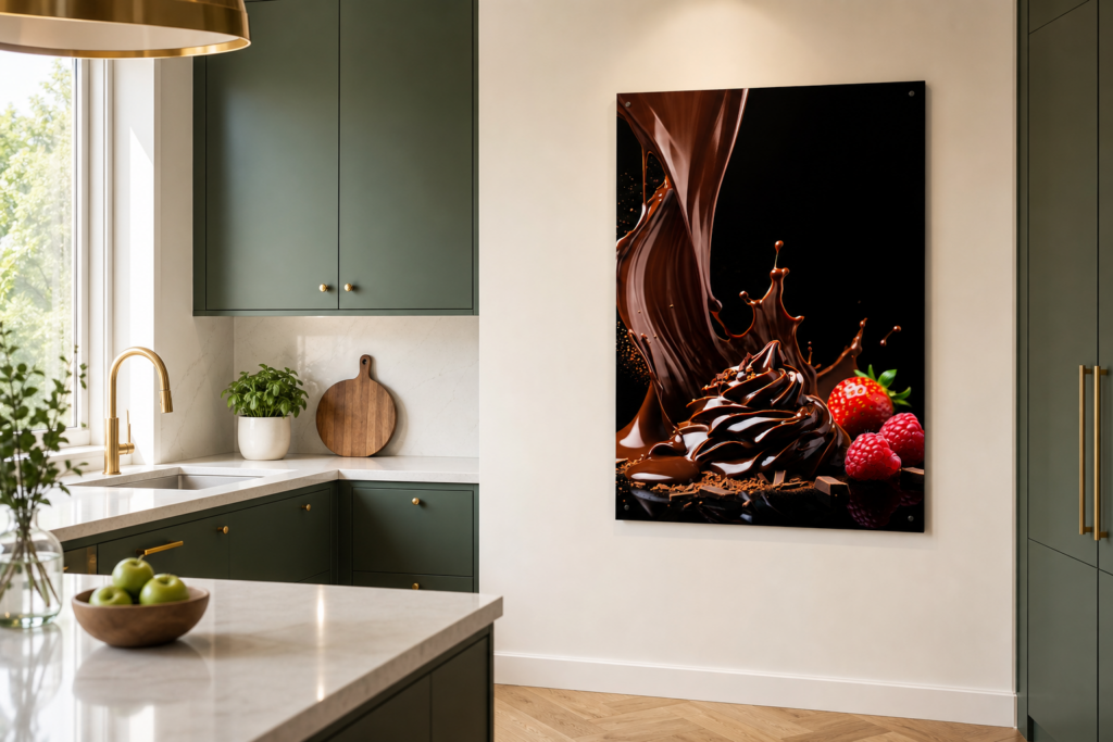
Rich, chocolate-toned culinary graphic art introduces warm, grounded neutrals to a bright, contemporary kitchen, setting a cozy and inviting tone for 2026 dining trends.
This is our own design on Displate — buying through our link earns us a small commission at no extra cost to you. Details
👉 View this design on Displate
Bringing It Together
Kitchen and dining walls are some of the most rewarding to style and the most demanding to get right. Use the vertical space these rooms tend to waste, choose warm, grounded colors that make a dining zone feel welcoming, and — above all — pick a material that can survive the environment. Paper buckles and canvas absorbs grease, so for the one part of the home filled with steam and splatter, a wipe-clean, moisture-proof surface like metal is the practical winner. Get those right and these everyday rooms become some of the most characterful in the house.
If you want to nail the proportions before you hang anything, our guide on how to choose the right wall art size for any room covers sizing for the wall, and to dig deeper into why material matters so much here, see metal posters vs paper prints: which is actually worth it.
Published 06/20/2026 · Last updated 06/20/2026