When you’re buying wall art, you’ll often face a choice that’s easy to overlook but makes a real difference: matte or gloss finish? It might sound like a minor detail, but the finish changes how your art looks throughout the day, how it handles light, and even how it feels in the room. Pick the wrong one and a beautiful design can end up lost behind glare or looking flatter than you hoped. Here’s how to choose with confidence.
The Short Version
If you want the quick answer: gloss makes colors pop and suits darker or low-light rooms, while matte stays glare-free and looks great almost anywhere, especially bright spaces. When in doubt, matte is the safer all-rounder. But the right pick really depends on your room, so let’s break it down.
What a Gloss Finish Does
A gloss finish has a smooth, slightly reflective surface. That reflectivity does something nice: it deepens dark tones and makes colors look richer and more vibrant. Blacks look deeper, brights look punchier, and the whole image gains a sense of contrast and depth. For bold, colorful, or photographic designs, gloss can make the artwork genuinely pop.
The trade-off is reflections. Because the surface is shiny, it catches light — which is wonderful in the right spot and frustrating in the wrong one. Place a glossy piece directly opposite a bright window and you may find yourself staring at a reflection instead of the art.
Gloss works best in: rooms with soft, controlled lighting; darker spaces like a gaming room, media room, or a wall away from direct sunlight; and for vivid, high-contrast designs you want to feel dramatic.
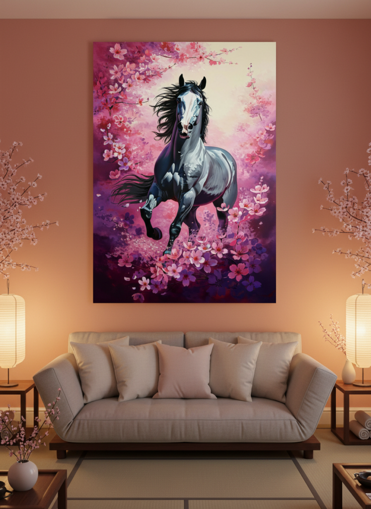
Bold, colorful designs gain real depth and punch from a glossy surface. View this design on Displate
What a Matte Finish Does
A matte finish has a smooth, non-reflective surface that absorbs light rather than bouncing it back. The result is a softer, more refined look with no glare from any angle. Colors are very slightly more muted than gloss, but in exchange you get a calm, elegant, gallery-like quality that suits almost any room.
The biggest practical advantage of matte is its forgiving relationship with light. You can hang it next to a window, across from a lamp, or in a bright, sunny room, and it’ll stay perfectly readable all day. Matte surfaces also tend to resist fingerprints and smudges better, which is handy in busy households or spaces with kids.
Matte works best in: bright rooms or anywhere with lots of natural light; spaces where the art faces or sits near a window; minimalist, modern, or calm interiors; and high-traffic areas where you don’t want to worry about smudges.
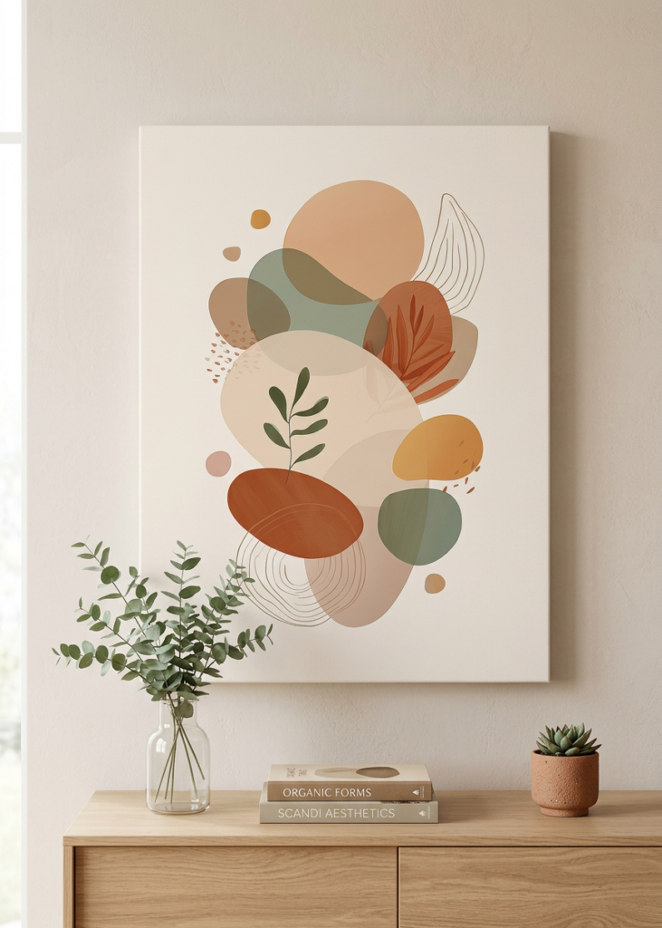
A matte finish stays glare-free and elegant, even in a bright, sunlit room. View this design on Displate
How to Choose: Match the Finish to the Room
The easiest way to decide is to think about two things: your lighting and your design.
Start with lighting. Walk over to the wall where the art will hang and notice the light. Is it a bright spot with lots of sun or a window nearby? Lean matte. Is it a dim, cozy, or controlled-light area? Gloss will shine there — literally. The single most common regret people have is putting a glossy piece in a bright room and fighting glare forever.
Then consider the design. Bold, vivid, photographic, or high-contrast artwork tends to benefit most from gloss, which amplifies that drama. Soft, minimalist, pastel, or illustrative artwork often looks best in matte, which keeps it calm and refined. If your design is somewhere in between, matte is the dependable choice.
A Few Real-World Scenarios
To make it concrete, here’s how I’d choose in common situations:
A sunny living room with big windows: matte, every time — you’ll avoid glare and enjoy the art at any hour. A dark gaming or media room: gloss, to make those vivid colors and deep blacks really come alive. A home office with a window beside the desk: matte, so reflections don’t distract you while you work. A hallway or stairwell with mixed lighting: matte is the safe, consistent pick. A bold pop-art or neon-style design on a shaded wall: gloss, to lean into the drama.

When you’re unsure, matte is the dependable all-rounder that looks good anywhere. View this design on Displate
Don’t Overthink It
Here’s the reassuring truth: there’s no “wrong” finish, only a better fit. Both look great — they just suit different conditions. If you genuinely can’t decide, go matte. It’s the more forgiving choice, works in the widest range of rooms, and you’ll almost never regret it. Save gloss for the moments when you have a bold design and a lighting setup that lets it shine.
Final Thoughts
The finish you choose shapes how you experience your art every single day — so it’s worth a moment’s thought. Match gloss to controlled lighting and bold designs; match matte to bright rooms and calm, refined spaces. Get that pairing right, and whichever finish you pick, your art will look exactly as good as the day you fell in love with it.